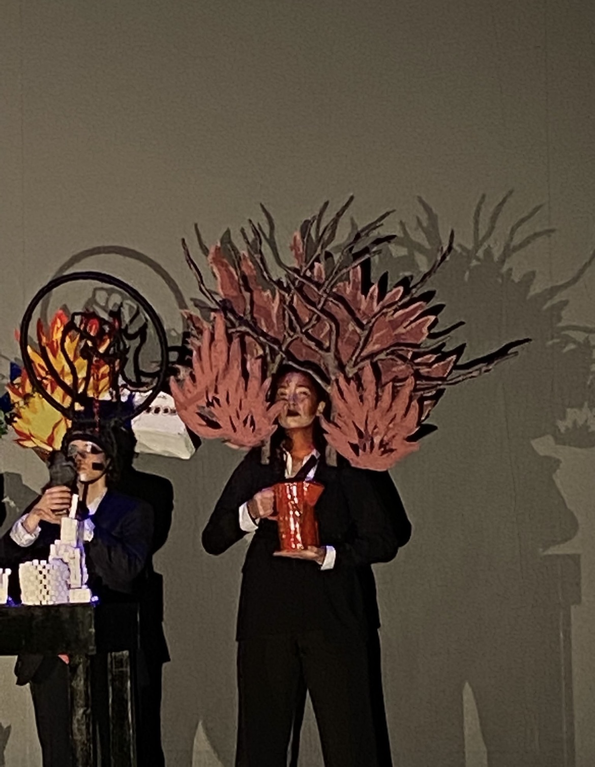
Australian Bushfires
Animation by Vicky Lee
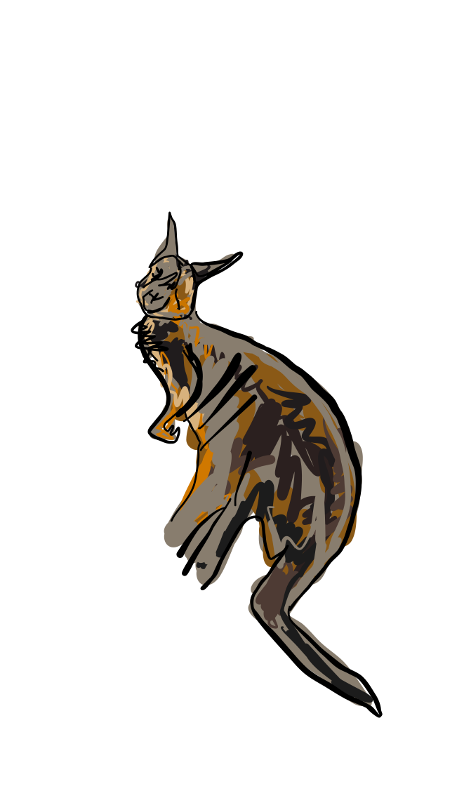
Congressman Australian Bushfires
28 th of October 2020

Esme Solomon from PDP 2nd year, made a crochet koala. We initially wanted to make crochet flames as well but realised that tissue paper would look just as good to be honest. And would actually be more noticeable.
The Koala would be burning in the fire, this symbol felt emblematic of the australian bushfires, just as kangaroos in fire were. On instagram, the mean of communication of most youngs, there were #koalas burning everywhere.
![]()
![]()
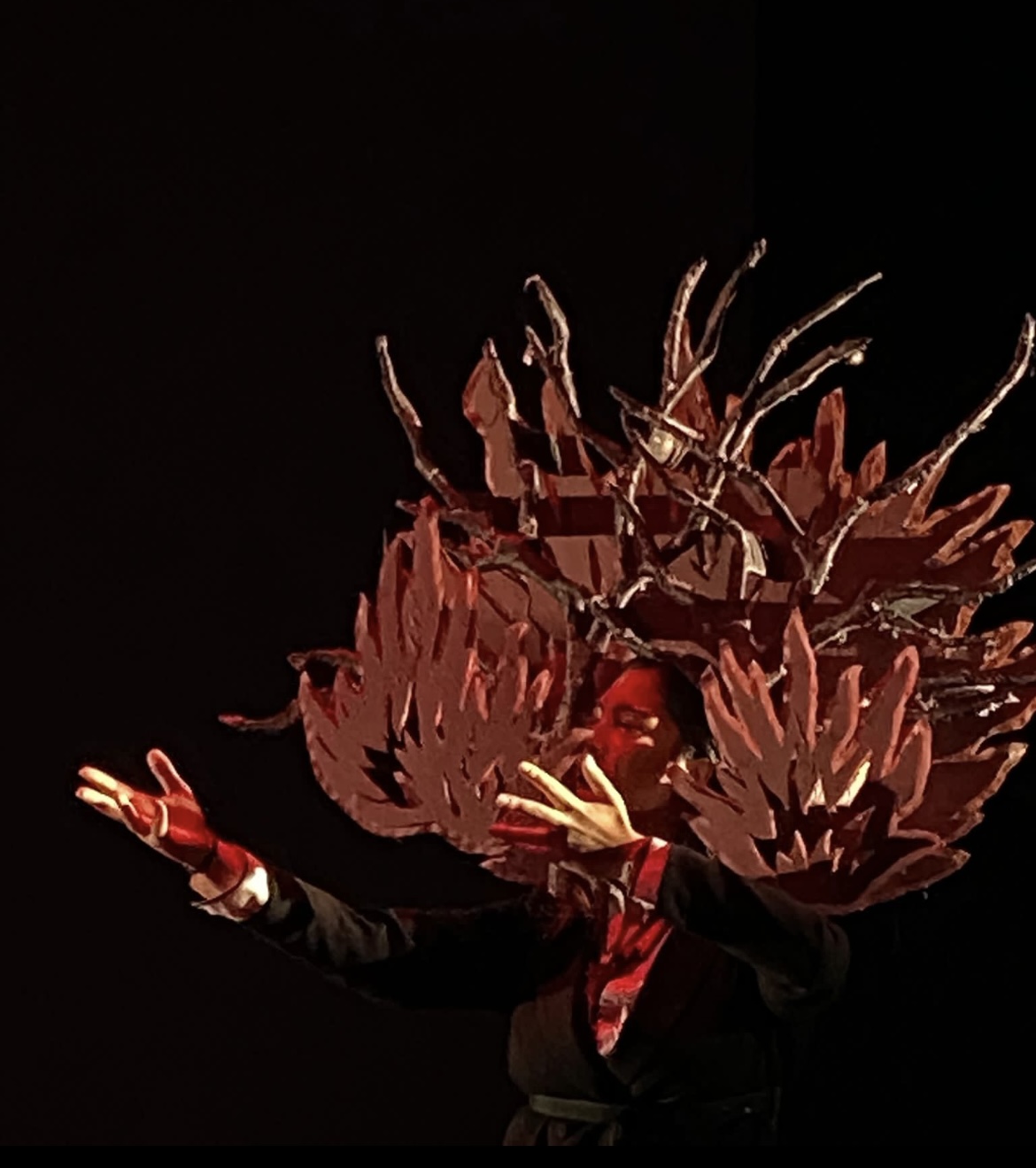
I worked then with Hongji Yan, BA Womensear 1st year, and we made foamboard flames, I wanted them to be quite huge and to feel as if the head was on fire.
![]()
The head in between the bush. Unfortunately this piece wasn’t adapted for performative purposes. It wasn’t sturdy, and would never last should there be movements. Secondly it wouldn’t look very good as it wasn’t it surrounding the head properly and wasn’t sitting on the shoulders well. So I made a backpack structure similar to the one I made for Covid. I unfortunately didn’t take any pictures. This was a good solution to overcome the stability issue.
![]()
![]()
The Koala would be burning in the fire, this symbol felt emblematic of the australian bushfires, just as kangaroos in fire were. On instagram, the mean of communication of most youngs, there were #koalas burning everywhere.
I worked then with Hongji Yan, BA Womensear 1st year, and we made foamboard flames, I wanted them to be quite huge and to feel as if the head was on fire.
The head in between the bush. Unfortunately this piece wasn’t adapted for performative purposes. It wasn’t sturdy, and would never last should there be movements. Secondly it wouldn’t look very good as it wasn’t it surrounding the head properly and wasn’t sitting on the shoulders well. So I made a backpack structure similar to the one I made for Covid. I unfortunately didn’t take any pictures. This was a good solution to overcome the stability issue.
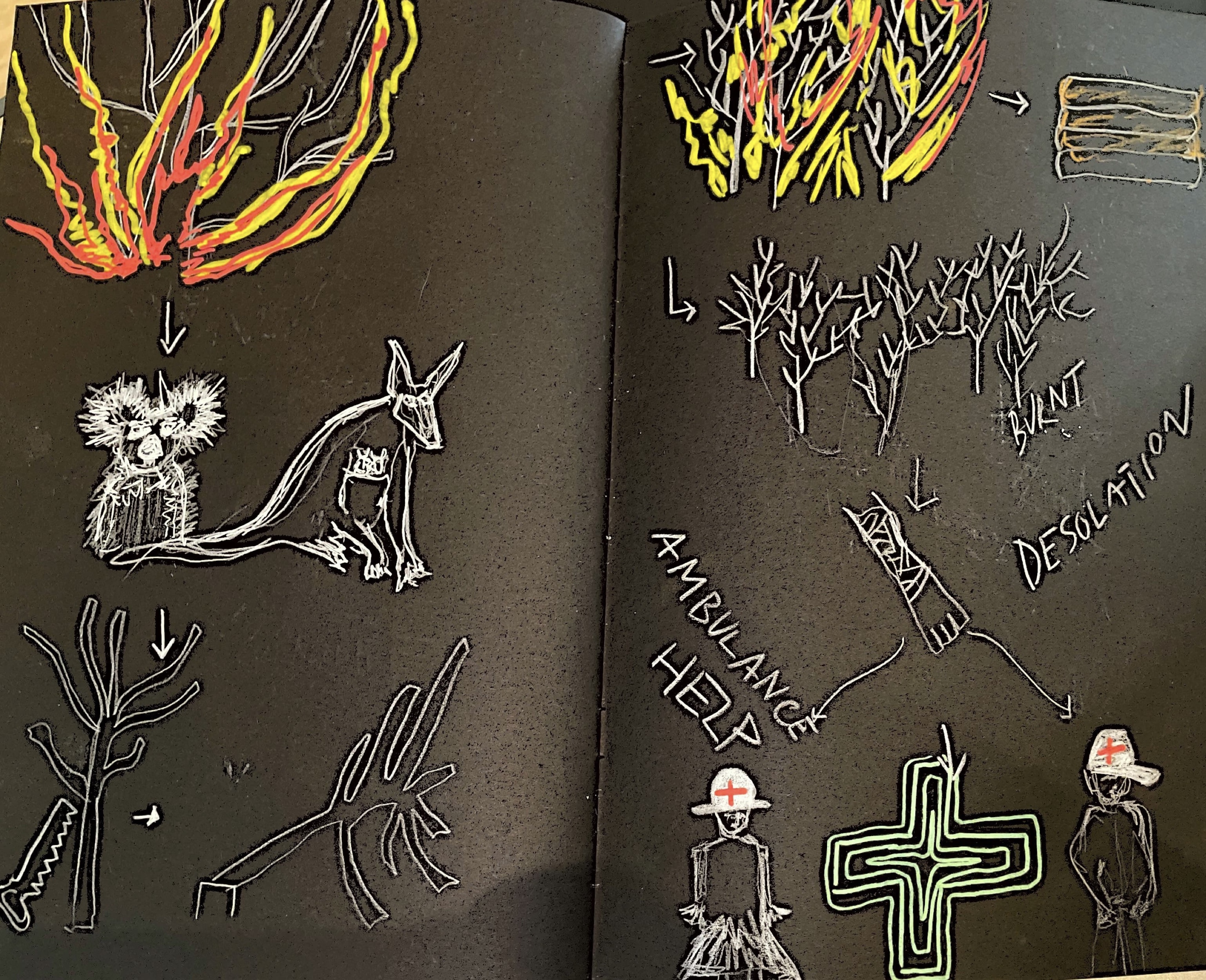
For The Australian Bushfires, we wanted to make a significant headpiece and to give the impression of being in fire. At first I started making a papier mache tree and hang a koala but somehow wanted to make the piece even more dramatic.

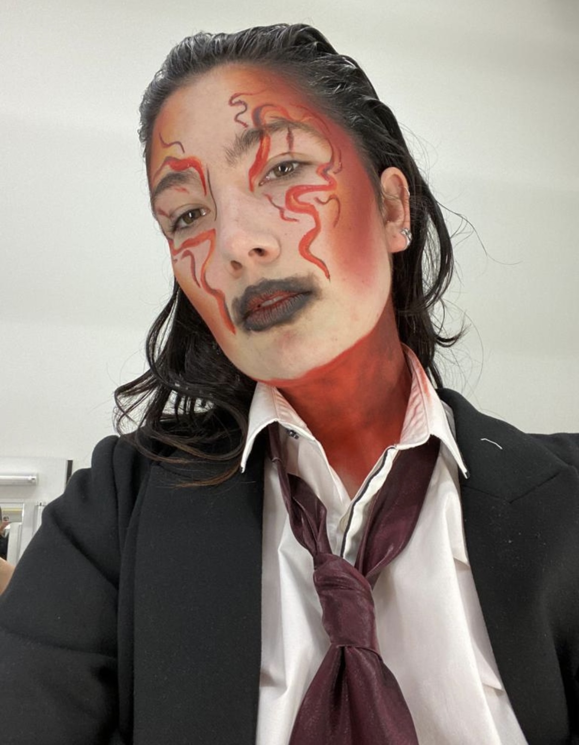
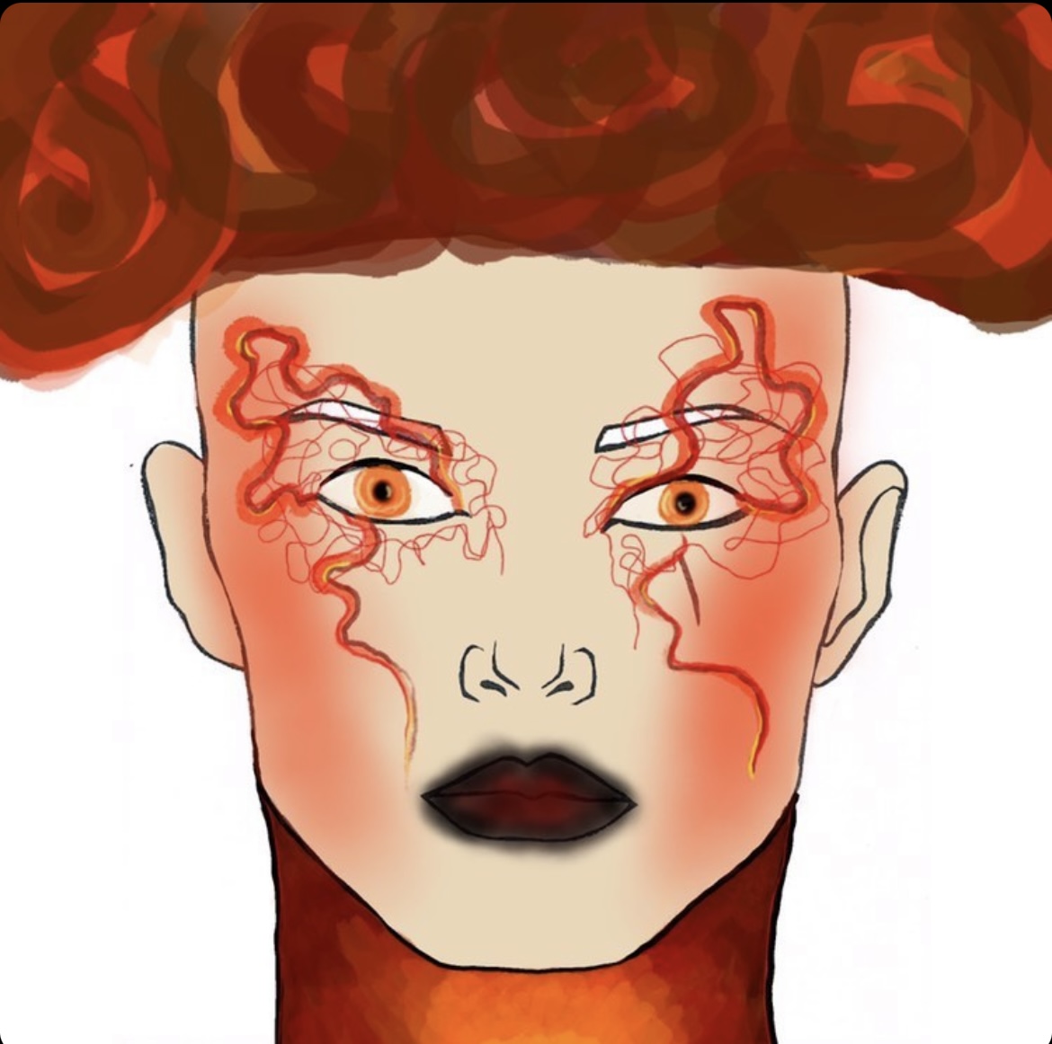 Makeup look by Sylvian Lockwood
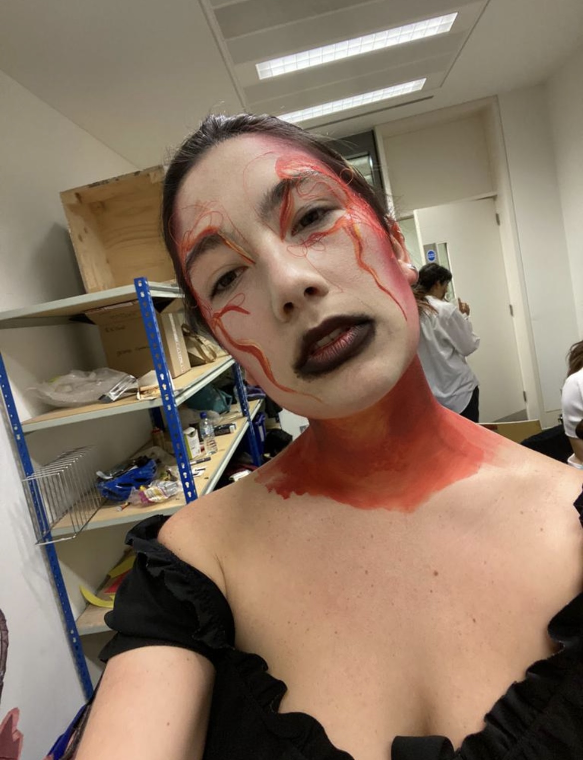 This makeup photo was taken on the first day, when Sylvian added strings, this was a very beautiful design however it was taking hours and wouldn’t be noticeable on stage anyways, so we scratched the string idea for the rest of the performances.
I worked with Emma Berardi for the ceramic teapots from Chelsea Industrial design. When we met throughout the process, the jug would get better everytime. We went for a minimalistic-straight to the point - approach, as we felt it would be more striking. Trees over a red backgrond, just like the photos.
![]()
![]()
![]()
![]()
![]()
![]()
These were much smaller designs, we decided to paint the trees brown, and have the jug even bigger and more cylindrical as well. I also think that having the trees in relief would look even better.
This is the final version of teapot and mug.
![]()
